Description
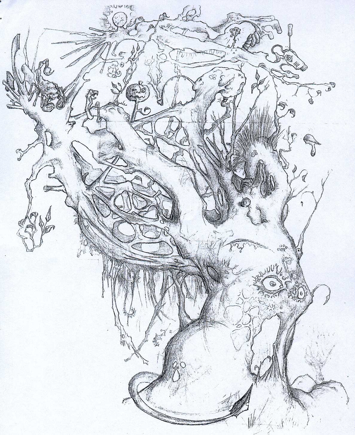
Illustration who starts the ‘organic‘ phase.
With the Tree begins a musicalized conception of the composition. Despite the disparity of elements, these form a harmonious set, the illustration’s different elements are like musical notes that are structured giving a rhythm to the image.
I was worried about the correct use of space, to fill it neatly, without the elements being disturbed among them, -all the elements should had their relative and proportional space.
I think the division of the image in general structures or ‘sections’ was very useful to put order on all these elements, and to make it visually understandable. The Tree also initiates a deep understanding of the visual tensions and moviments, as well as a first attempt to dominate the visual ‘silences’.
Project Details
| Author: | Mitus |
| Date: | 2003 |
| Dimensions: | 42 x 29,7 cm. |
| Technique: | Pencil |

